Managing Callouts
You can manage your callouts from the Presentation tab. To display the callout definition area in the Presentation tab, click the Callout tab at the bottom of the Presentation pane. A hierarchical tree of the callouts in the project appears under the root of the tree called Callout, or in a folder. You can define a new, blank callout, or you can select predefined callouts from the callout library.
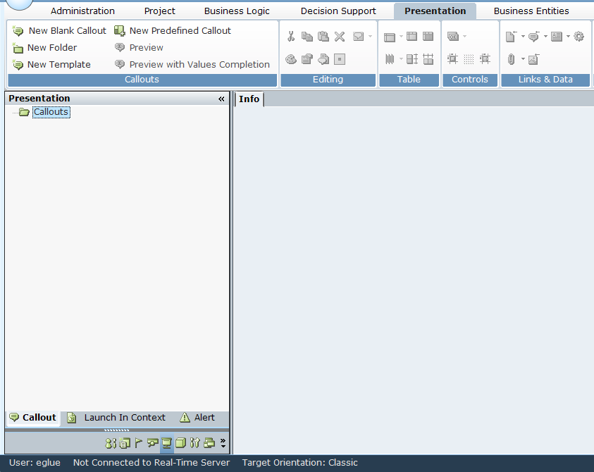
The Real-Time Designer provides a rich variety of tools for creating, designing, and editing callouts.

In addition to standard Paragraph and Font options, the toolbar includes the following callout-specific options:
-
Number 3
Callouts Options
The following callout-specific options are available on the Callouts area of the toolbar:
-
New Blank Callout: Enables you to define a new callout, as described in Defining Callouts Using a New Blank Callout.
-
New Predefined Callout: Enables you to define a new callout based on an existing template, as described in Defining Callouts Using Predefined Callouts.
-
New Folder: Enables you to define a new callout folder in which you can organize callouts. Select the root of the Callout tree, or select another folder and then click New Folder.
-
New Template: Enables you to create a callout template. All callouts which are created using the template have the same properties as the template, as described in Designing and Using a Callout Template.
-
Preview: Displays this callout as it will be shown on an agent's desktop.
-
Preview with Values Completion: Displays a preview of the callout, including its dynamic data, as described in Previewing a Callout with Dynamic Data.
Editing Options
In addition to standard editing options, the Editing options include:
-
Style Editor
 : Displays a window providing a variety of options for visually editing the style of HTML text and graphic elements.
 -
Properties Window
 : Displays a pane on the right side of the main window, which provides a variety of options for viewing and editing the HTML properties of the selected elements in the callout.
The Real-Time Designer provides all the tools you need to design callouts. These HTML features are provided only as an extra.
-
Edit Callout Parameters
 : Displays a window providing a variety of options for defining parameters that can be used in the callout, as described in Adding and Defining Callout Parameters.
 -
Edit Callout Location
 : Displays a window providing a variety of options for defining the location on the agent's screen on which the callout is displayed. This window provides the same options as the Location property in the Properties panel.
Table Options
The Table options enable you to perform standard table-related actions, including adding and formatting tables and their content.
You can also use the Properties window to define your table.
Controls Options
The Controls options provide various GUI elements that can be inserted into a callout, such as buttons and dropping menus.

 Elements
The Elements tool displays a drop-down of input controls that can be added.
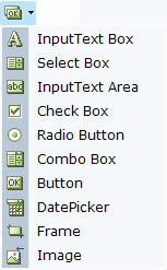
The following examples describe the use of these tools. Other Elements tools are used in a similar manner.
Input Text Box Control - Example
The Input Text Box control adds a text box to the callout, which enables the agent to enter text into this box:
You can set the initial value to be displayed in this text box using the Assignment Tool. To do so, right-click and select Assignments.
You can now type in a value or to bind this textbox to a business entity's property so that the latest value of that property is shown here.
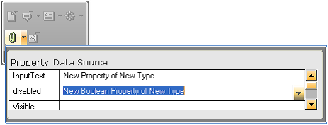
Control Dependency - Example - Checkbox / Input Text Box
Real-Time Designer enables you to create dependencies between controls in a callout, for example, so that the value of a checkbox (checked or cleared) determines whether another field is enabled or disabled.
The Check Box control adds a checkbox to the callout, whose value is specified in the Checked field to be linked to a property of a business entity that is of type Boolean:
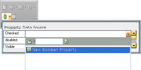
Interdependency can be created between the checkbox and the text box that was created in the previous example by binding the disabled field of the Input Text box to the same business entity property as the checkbox:
This definition specifies that the Boolean property is True, the checkbox is selected and the textbox is disabled; When the Boolean property is False, the checkbox is cleared and the textbox is enabled.
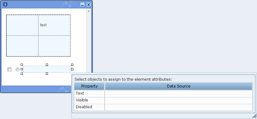
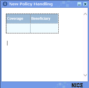
Table Binding - Example
Real-Time Designer enables you to add an input control to each primitive property of an appropriate (bindable) business entity. This option enables you to change the values presented in a table (input binding). When this option is not used (the default), it is not possible to edit the values in the table.
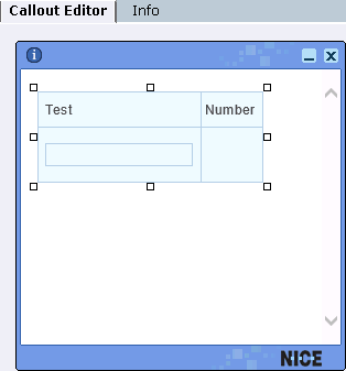
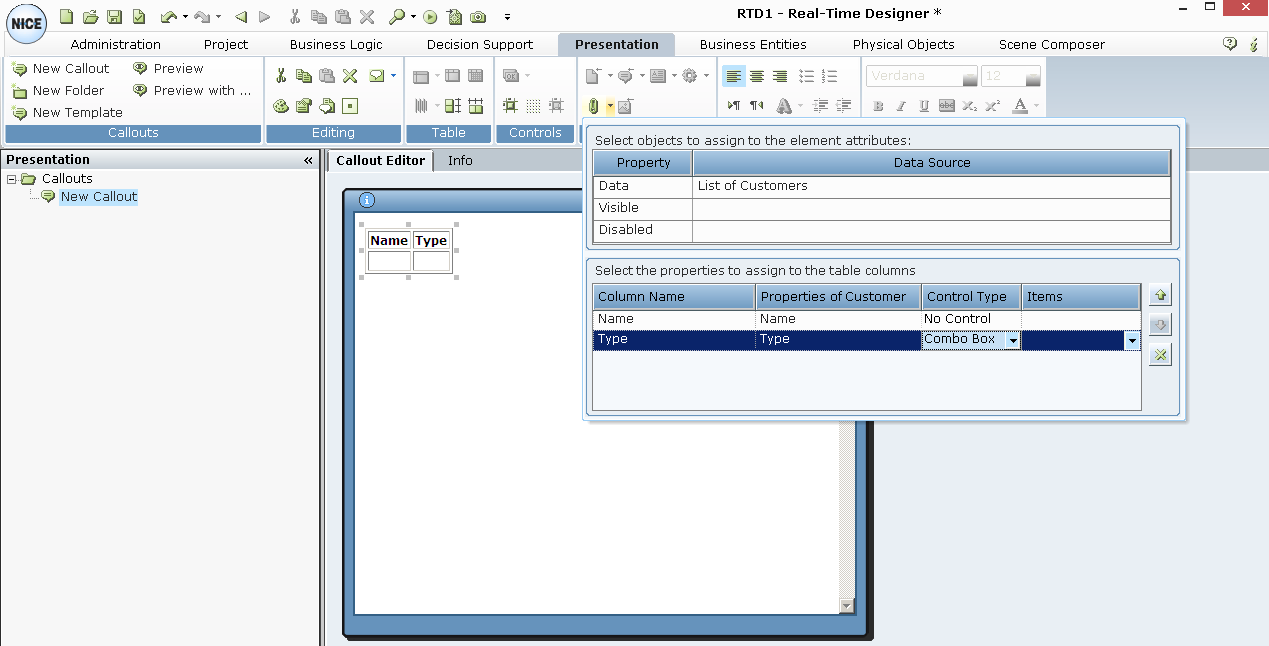
For example, the window below shows a List entity where each item in list has two properties: Text and Number.
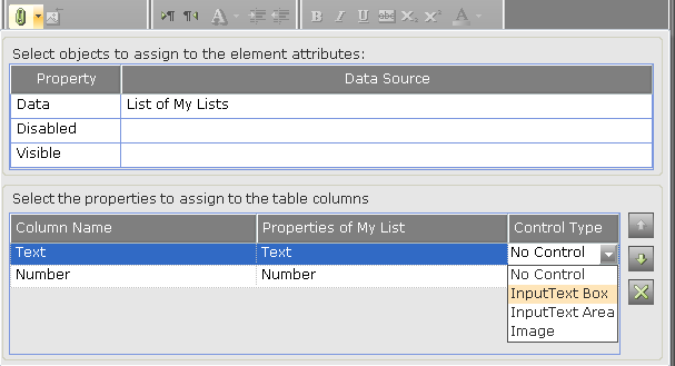
You can assign a control to both the Text and Number properties. For example, for a property of type Text, such as the Text property shown above, you can assign an InputText Box, InputText Area or Image control type. For our example, the InputText Box control type was selected, which enables you to both display the values of the business entity, plus to input values:
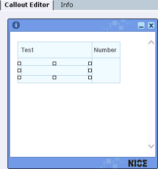
To define the control type for the Number property in our example, first select the entire table in the callout:
Then, select the control type for the Number property, which is InputText Box:
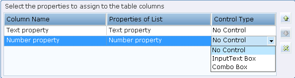
Image Control - Example
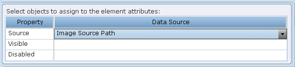
The Image control binds a control to a text business entity or a property of a composite business entity whose value is a path to an image file. Thus, this control allows you to change an image in a callout at run time (based on business logic), rather than use a static image.
To do so, first create an empty image control in the callout:
At this point, no source image has been defined for the Image control.
Next, click the Assignment button to assign the applicable source image to the Image control:
Then, select the data source for the image, which must be of type Text. Typically, this is a business entity property.
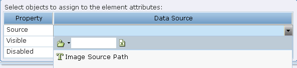
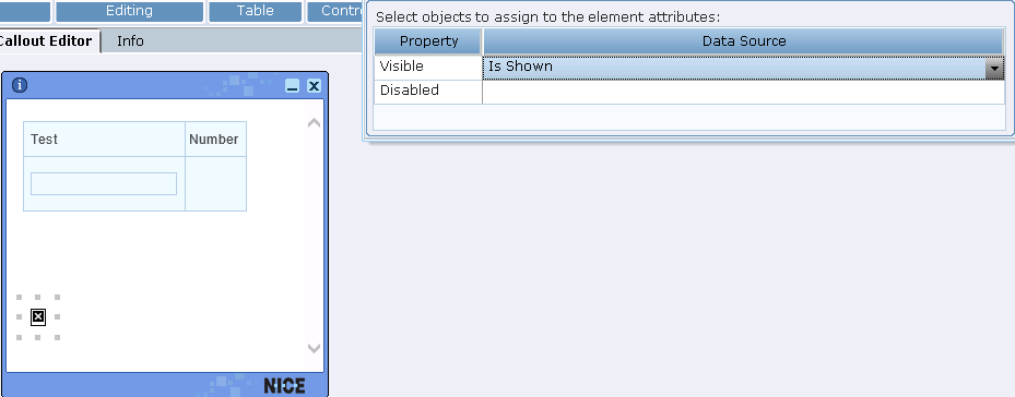
Image Visibility - Example
You can choose to show or hide an image by binding it to a Boolean property.
To do so, click the Insert Image tool to insert an image into a callout, as described in .
After the image is added to the callout, you can make it visible or invisible by binding it to a Boolean property:
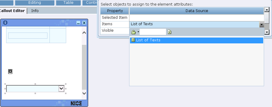
Combo Box Control - Example 1
Some controls require the assignment of a set of values, such as a combo box or drop-down list. The Combo Box option adds a combo box to the callout:

A business entity property of type List can then be assigned to this control to give it is values:
A list of constants can also be entered.
The values of the list items can be entered in the following ways:
By entering the values into the List Type property of the business entity.
By clicking the Collection property in the Properties panel to display the following window:
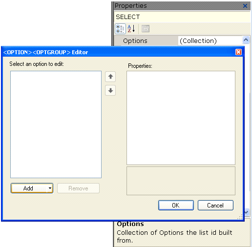
Select an option from the Select an option to edit list and then click Add button to move it to the Properties list. The values in the Properties list are assigned to the control in the callout.
Combo Box Control - Example 2
When you select the Combo Box control, another column called Items is displayed in which you select the source of the data for that column, meaning the values for the cells of that column:
The Items column must be a list of other business entity types.
Button Control - Example
The Button control specifies the characteristics for button text. Button text can either be fixed or can be bound to a Designer object so that it dynamically changes. To bind the button to a Designer property, right-click it and select Assignment to open the Assignment window.
Date Picker Control Example
The Date Picker control option adds a control that enables an agent to select a date.
Selecting the Date Picker option adds the following function to the callout:
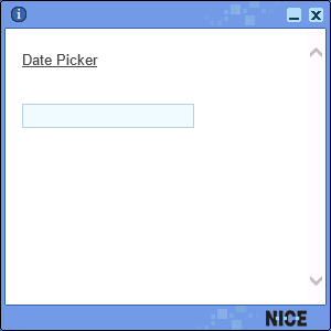
Click the Date Picker function to display a calendar control, where you can set the date.
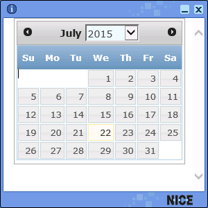
The Date Picker control uses an ActiveX control that is installed by default on every Windows-based computer.
This control can be bound with a business entity property of type DateTime so that it shows the latest value of the property, meaning that the value of the property is output to the callout.
Frame Control - Example
The Frame control adds a standard HTML frame to the control into which you can bind content, such as an HTML page:
The content of a web page can only appear in a callout inside a frame.
Radio Button Control - Example
The Radio Button control adds a standard HTML radio button element to the callout content:
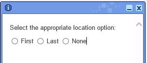
To group radio buttons, you must specify the same group name value in the Name property of the radio button element.
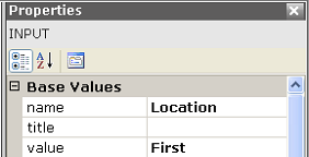
To specify which value is assigned to the business entity that the radio button is bound to, you must specify the value per radio button element.
 Enable 2D Position Mode for the Selected Element
This control determines if the control is displayed inline with text, so that the text wraps around it, or whether it is displayed in front of the text in the callout.

 Show Grid
The Show Grid control displays a grid on the background of the control in Real-Time Designer enabling you to more easily align the controls and the text.
 Snap 2D Positioned Elements to Grid
This control toggles all elements from inline positioning to absolute positioning.
Links & Data Options
The Links & Data tools provide a variety of options for specifying the dynamic information to be included in a callout.
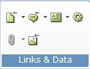
The following Links & Data tools are available:
 : Launch in Context: Enables you to create a link in a callout that displays a document in the context of its standard application, such as a *.doc file in Word or a *.bmp file in PaintShop Pro. See Launch in Context for more information.
 : Callout Link: Enables you to insert a link into a callout, to another callout. A selection of the callout already defined is shown. When an agent clicks this kind of link, another callout is displayed in the same frame.
If you create a link to a callout that has callout parameters defined for it, the following window is displayed in which you can set or modify the values for those parameters:
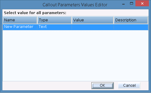
Click in the Value column of each row and use the Assignment Tool to specify a value.
See Adding and Defining Callout Parameters for more information.
 : Dynamic Text: Enables you to insert text in a callout that reflects the value of a business entity's property and that may change to reflect the new value of that property each time it changes. See Entering Text in a Callout for more information.
 : Action Link: Enables you to insert a link into the callout, which when clicked activates an action that can be defined in the Action Editor (see Action Editor). This can activate one of the functions defined by default in Real-Time Designer, a workflow, or your own custom function.
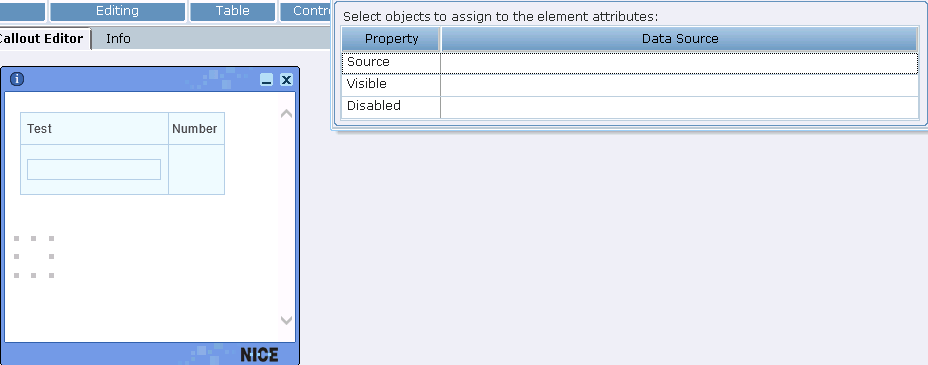
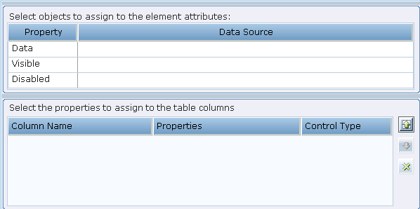
 : Assignment (Binding): Displays a window in which you can specify the properties of a business entity to be assigned to the visibility, disabled or value/items attribute of an HTML element. Refer to Controls Options for a few examples of using this tool.
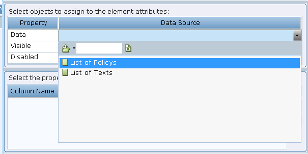
A List type property, as described in List Property – Example, can be assigned to a table in the callout, to be used as its data source. When a table is selected in the callout, clicking this tool displays the following window:
The following example shows a property that was defined in the business entity window with the type List. It could also have been an instance of type list.
This displays the options in this list as the columns of the table:
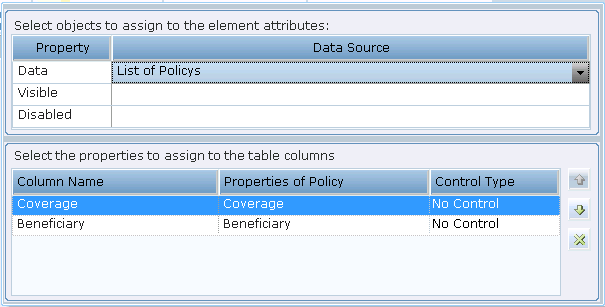
This shows a table in the callout:
As you can see the options in the table show the options from the List property assigned to it. When the callout is run, the rows of this table are populated with the values of the list.
 : Insert Image: Displays a window in which you can specify an image to be inserted into the callout:
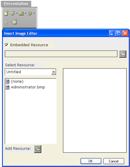
All standard image file formats can be used, such as BMP, JPG, GIF, and TIFF.
The left side of the window above lists all images that have already been imported into Real-Time Designer as an embedded resource. Each time you select an image on the left, its preview is displayed on the right. Double-click one of the image file names to display it and then click OK to select it.
To embed another image file into Real-Time Designer, click Add Resource to display a standard section window from which you can select the file to import.
After you insert the image, you can replace it by right-clicking it and selecting Replace Image.
You can also insert an image by specifying a file path, for example, if it is too large.