


The Controls tools provide various GUI elements that can be inserted into a callout, such as buttons and dropping menus.

 Elements
The Elements tool displays a drop-down of input controls that can be added.
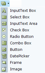
The following examples describe the use of these tools. (Other Elements tools are used in a similar manner.)
Input Text Box Control - Example
The Input Text Box control adds a text box to the callout, which enables the agent to enter text into this box:
You can set the initial value to be displayed in this text box using the Assignment Tool. To do so, right-click and select Assignments.
You can now type in a value or to bind this textbox to a business entity's property so that the latest value of that property is shown here.
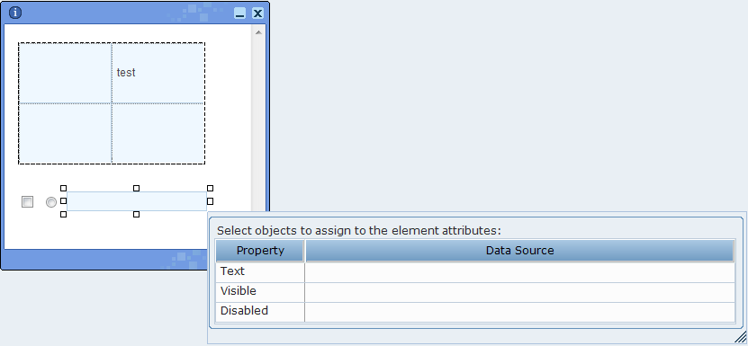
Control Dependency - Example - Checkbox / Input Text Box
Real-Time Designer enables you to create dependencies between controls in a callout, for example, so that the value of a checkbox (checked or cleared) determines whether another field is enabled or disabled.
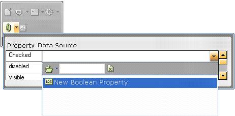
The Check Box control adds a checkbox to the callout, whose value is specified in the Checked field to be linked to a property of a business entity that is of type Boolean:
Interdependency can be created between the checkbox and the text box that was created in the previous example by binding the disabled field of the Input Text box to the same business entity property as the checkbox:
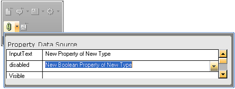
This definition specifies that the Boolean property is True, the checkbox is selected and the textbox is disabled; When the Boolean property is False, the checkbox is cleared and the textbox is enabled.
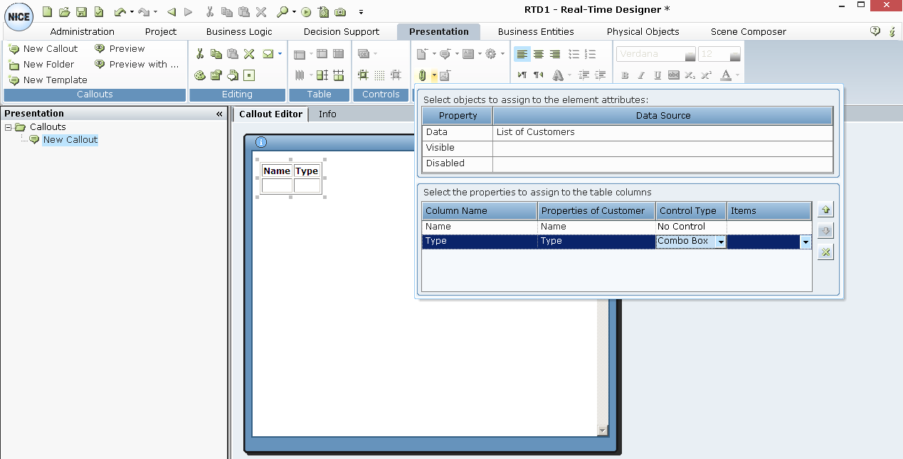
Table Binding - Example
Real-Time Designer enables you to add an input control to each primitive property of an appropriate (bindable) business entity. This option enables you to change the values presented in a table (input binding). When this option is not used (the default), it is not possible to edit the values in the table.
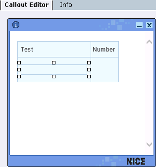
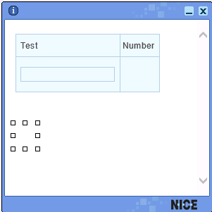
For example, the window below shows a List entity where each item in list has two properties: Text and Number.
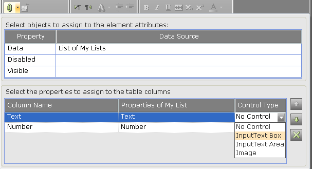
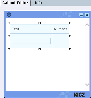
You can assign a control to both the Text and Number properties. For example, for a property of type Text, such as the Text property shown above, you can assign an InputText Box, InputText Area or Image control type. For our example, the InputText Box control type was selected, which enables you to both display the values of the business entity, plus to input values:
To define the control type for the Number property in our example, first select the entire table in the callout:
Then, select the control type for the Number property, which is InputText Box:
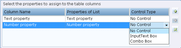
Image Control - Example
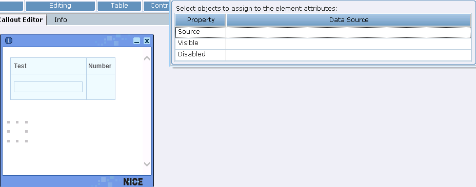
The Image control binds a control to a text business entity or a property of a composite business entity whose value is a path to an image file. Thus, this control allows you to change an image in a callout at run time (based on business logic), rather than use a static image.
To do so, first create an empty image control in the callout:
At this point, no source image has been defined for the Image control.
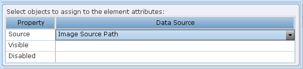
Next, click the Assignment button to assign the applicable source image to the Image control:
Then, select the data source for the image, which must be of type Text. Typically, this is a business entity property.
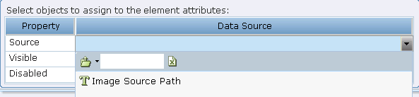
Image Visibility - Example
You can choose to show or hide an image by binding it to a Boolean property.
To do so, click the Insert Image  tool to insert an image into a callout, as described in Links & Data Tools.
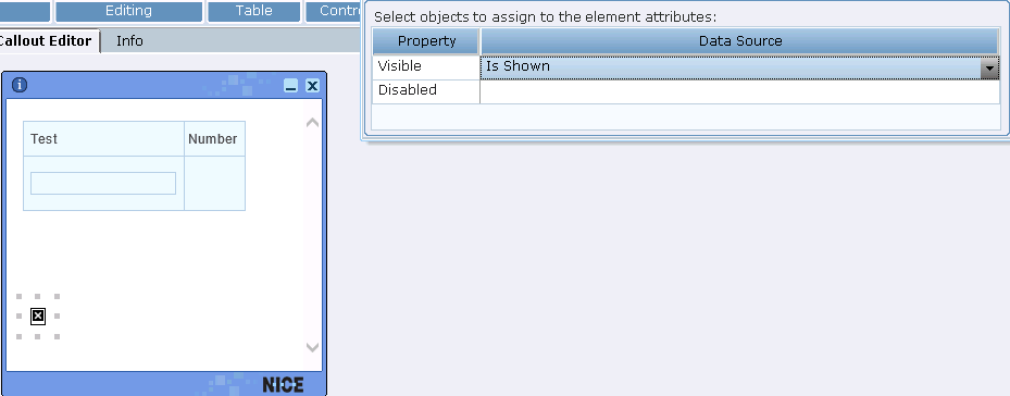
After the image is added to the callout, you can make it visible or invisible by binding it to a Boolean property:
Combo Box Control - Example 1
Some controls require the assignment of a set of values, such as a combo box or drop-down list. The Combo Box option adds a combo box to the callout:

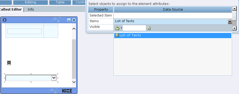
A business entity property of type List can then be assigned to this control to give it is values:
A list of constants can also be entered.
The values of the list items can be entered in the following ways:
By entering the values into the List Type property of the business entity.
By clicking the Collection property in the Properties panel to display the following window:
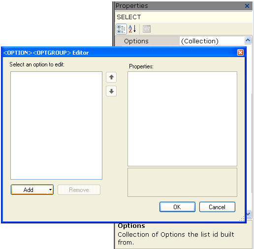
Select an option from the Select an option to edit list and then click Add button to move it to the Properties list. The values in the Properties list are assigned to the control in the callout.
Combo Box Control - Example 2
When you select the Combo Box control, another column called Items is displayed in which you select the source of the data for that column, meaning the values for the cells of that column:
The Items column must be a list of other business entity types.
Button Control - Example
The Button control specifies the characteristics for button text. Button text can either be fixed or can be bound to a Designer object so that it dynamically changes. To bind the button to a Designer property, right-click it and select Assignment to open the Assignment window.
Date Picker Control Example
The Date Picker control option adds a control that enables an agent to select a date.
Selecting the Date Picker option adds the following function to the callout:
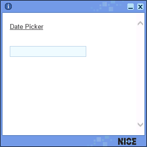
Click the Date Picker function to display a calendar control, where you can set the date.
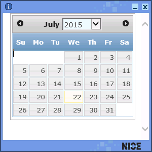
The Date Picker control uses an ActiveX control that is installed by default on every Windows-based computer.
This control can be bound with a business entity property of type DateTime so that it shows the latest value of the property, meaning that the value of the property is output to the callout.
Frame Control - Example
The Frame control adds a standard HTML frame to the control into which you can bind content, such as an HTML page:
The content of a web page can only appear in a callout inside a frame.
Radio Button Control - Example
The Radio Button control adds a standard HTML radio button element to the callout content:
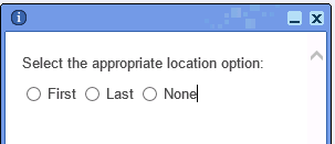
To group radio buttons, you must specify the same group name value in the Name property of the radio button element.
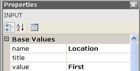
To specify which value is assigned to the business entity that the radio button is bound to, you must specify the value per radio button element.
 Enable 2D Position Mode for the Selected Element
This control determines if the control is displayed inline with text, so that the text wraps around it, or whether it is displayed in front of the text in the callout.

 Show Grid
The Show Grid control displays a grid on the background of the control in Real-Time Designer enabling you to more easily align the controls and the text.
 Snap 2D Positioned Elements to Grid
This control toggles all elements from inline positioning to absolute positioning.