

Grid Control Properties
Tables without both columns separators AND header separators are currently not supported, and tables without both row separators AND header column separators can support single line cells only.
|
Simulated Control Property |
Description |
Default Value |
|||||||||||||||||||||
|---|---|---|---|---|---|---|---|---|---|---|---|---|---|---|---|---|---|---|---|---|---|---|---|
|
Bind to |
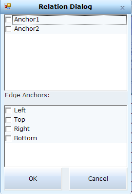
Connects a control to an anchor. Use in a dynamic UX for Owner Drawn controls that might move or be resized with the window. From version 7.1, you can also bind a control to the edges of the window. This is useful when a control keeps its relative position as the window is resized, for example, a button in the bottom-right corner of the window. In this case, select Bottom and Right to anchor the control to the bottom-right corner of the window. You can also anchor a control to opposite edges of the window. For example, if a control is stretched to maintain the anchored distance to the top and bottom edges of the window, as the window is resized, you can select to anchor the control to the Top and Bottom.
|
|
|||||||||||||||||||||
|
Test Properties |
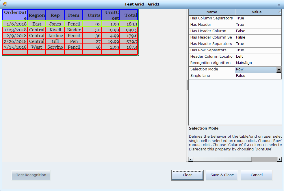
Click Test to open a window and show the grid as it is validated. The headers appear framed in blue, the cells are framed in red, and the selection mode (cell, row or column) in green. When testing the recognition, you can modify the relevant properties, and then click Test Recognition. Once you find the optimal settings, click Save & Close to save the changes to the properties and close the window To clear the frames in the grid, click Clear. To close the window without saving the changes to the properties, click Cancel.
From version 7.2, you can remove a line from a grid. To remove a line:
From version 7.2, you can add a horizontal or vertical line to a grid. To add a line:
|
Test |
|||||||||||||||||||||
|
Control Type |
Select Grid. |
General |
|||||||||||||||||||||
|
Name |
Change the default for easy identification. |
Grid1 |
|||||||||||||||||||||
|
Use as Anchor |
True: Uses the control as an anchor to identify the frame. |
False |
|||||||||||||||||||||
| Use Events |
Toggles whether the control sends events to the client. False: Events happening in this control do not affect the flow of the solution, such as a TextBox control that is only used to display text. True: The solution needs to react to live behavior such as text changes in a TextBox. |
False |
|||||||||||||||||||||
|
Use Parent Shape |
Improves performance when retrieving an Owner Drawn shape. The Owner Drawn shape must be surrounded by a parent shape. The parent shape is searched instead of the entire frame, optimizing performance. True: Search the parent shape instead of the entire frame. |
False |
|||||||||||||||||||||
|
Has Column Separators |
Select whether or not there are separators between the columns in the table/grid. |
True |
|||||||||||||||||||||
|
Has Header |
Select whether or not there is a header row (at the top). |
True |
|||||||||||||||||||||
|
Has Header Column |
Select whether or not there is a header column (either to the left or the right depending on the Header Column Location property). |
False |
|||||||||||||||||||||
|
Has Header Column Separators |
Select whether or not their are header column separators. |
True |
|||||||||||||||||||||
|
Has Header Separators |
Select whether or not there are header row separators. |
True |
|||||||||||||||||||||
|
Has Row Separators |
Select whether or not their are separators between the rows in the table/grid. |
True |
|||||||||||||||||||||
|
Header Column Location |
Specifies whether the grid is from the left or the right, that is, where a row header (if it exists) is located. |
False |
|||||||||||||||||||||
|
Path |
Read-only. Position in the captured frame. This is an internal value used for advanced debugging. |
|
|||||||||||||||||||||
| Recognition Algorithm |
Selects a recognition algorithm. Select an option and use Test in Test Properties to view the results. Try the different algorithms to find the best one as their effectiveness varies according to the contrast, brightness and color of the grid elements: MainAlgo for the majority of grids. OrthoAlgo for grids with underlying orthogonal representation including column and row separators and unusual coloring. LineCalcAlgo to enhance ambiguous row and column definitions. ColorMitigationAlgo for grids that include a wide variety (and brightness) of colors. |
1 |
|||||||||||||||||||||
|
Rectangle |
Read-only. The shape boundaries. |
|
|||||||||||||||||||||
|
Selection Mode |
Defines the behavior of the table/grid on user selection. Choose Cell if a single cell is selected on mouse click. Choose Row If a row is selected on mouse click. Choose Column if a column is selected on mouse click. Disregard this property by choosing DontUse. |
DontUse Cell/Row/Column |
|||||||||||||||||||||
|
Shape Source |
Read-only. ShapeRecognized: The area was outlined by default or by manually calibrating the area. OwnerDrawn: The area was outlined using the Owner Drawn option. For controls: If the shape of this area changes when the window is resized, use the Bind to property to bind this control to an anchor for improved accuracy. |
ShapeRecognized |
|||||||||||||||||||||
|
Single Line |
Specifies whether there is only one line of text per row. |
False |